Thursday 27 May 2010

Paper product shots!

After assembling all my designs together, I got the chance to take some studio shots of them all together. I'm really pleased with the way these have turned out and have put them on my Behance site and had some positive feedback already.


Monday 24 May 2010

Paper Product cont.

Now the pattern itself has been settled on, the application is the next step, I've created it suitable to be a wrapping paper and gift bags, now I wish to create matching gift tags. From the crit last week, many felt that the characters should have more of their own 'spotlight' in the form of a gift/greeting card so thats my next step.

Format Ideas.

Debating the best possibly format for the greetings/gift card.

The square format is currently what I think will work best for the more rounded shapes of the characters.


This lengthier format could work for a design featuring multiple characters.


Standard portrait format will work well for framing longer less rounded characters.

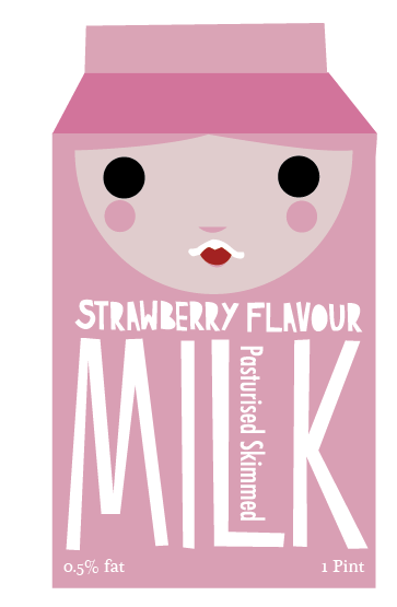
Experimenting with applying the pattern/designs, below, to a card format made me realise that a design of multiple characters will work better as a gift tag rather than a greetings card.


Like below!
                 Below, this is how I think it'll work!


Rounder characters on the square format card ^


Longer characters on the more portrait format.

Paper Product cont.

Continuing to try and resolve the products of my paper product design brief, after last weeks crit I realised the images of the characters printed onto the gift bags were far too small and thus losing detail, so I've decided to allow the images more room with less of them, so that the detail will be more visable.


                                                      Layouts for the gift bags.


Monday 17 May 2010

Memphis Belle tags!

As this brief is drawing to an end, I want to create some matching clothes tags for the product to match the rest of the designs and work as a set.


Playing with textures!

Wanting to add a bit more depth to my posters, here, playing with some textures!


Milk Poster design!

Here, is the final design of the Moo Milk poster!

Milk Poster design!

As a final design for this brief I want to create a poster aimed at young children and their families to promote milk drinking through healthy flavoured milks in a fun and non patronizing way.


Milk Designs!

After much experimenting with the designs character, these below are my final descisions on the matter.


Chocolate flavour


Strawberry flavour


Banana flavour

Milk Dev.

I feel that I'm perhaps over thinking the redesign of the central character and perhaps just need to simplify the design rather than over thinking and thus over complicating. I want to finalize the character so I can finalize the packaging and then create a poster to work alongside it.


I think the second design works the most successfully and much more simple. Now to apply it to the other types of milk.


Milk Dev.

After a successful and helpful crit with fellow studio members, one of the concerns that arose was the character design of the Milk packaging, specifically the design of the eyes, a few people mentioned they couldn't work out wether the eyes were staring open or closed, so due to this I decided to experiment with the design of the eyes.


Tuesday 11 May 2010

More pattern ex.

Using more than one illustration to create a less repetitive pattern featuring more of the animals created.