
Showing posts with label FMP Alice in Wonderland. Show all posts
Showing posts with label FMP Alice in Wonderland. Show all posts
Friday, 4 June 2010
Alice Book Cover Evaluation
This was the longest of all my briefs chosen and perhaps the one that was exploited the most, I enjoyed pushing a simple idea of a book cover design into a full event and the promotion surrounding it. I feel I was able to successfully utilize my illustration skills regarding hand rendered type and computer generated images. I feel the end result works well as a set and the style of the outcomes is suitable and has great impact particularly the use of illustrated hand rendered type. I feel that this brief has allowed me to develop skills in working with a set of outcomes for high impact including book cover design and further promotion.

Wednesday, 28 April 2010


Alice shots!
Having printed off my Alice project designs I decided to attempt to shoot them in a context relative to the content of the book, obviously I will shoot them in a context relative to the actual product too, but these are the first shots from said shoot.


Wednesday, 14 April 2010
Alice Bookmarks!
Working with the design that I have chosen for the book cover and the idea for the poster, below are some of the ideas working with this for the book marks, I think the key to there success will be keeping them simple but still working as a collective with the other designs.
Again,I have created each in the colour variants I am undecided one. Black still being my favourite.


 Once finalized, I think a red tassel threaded through will work well picking up on the red within the design.
Again,I have created each in the colour variants I am undecided one. Black still being my favourite.


Alice Posters cont.
Wanting to experiment with the colour of the posters as I'm still unsure on the colour for the book,so below some examples of variations matching the books.


The black style is still my favourite for the design, I'm going to see how it works alongside the rest of the designs produced before I make a final decision.

Alice Posters!
As said before, I wanted to extend this brief into an event, a book reading, below my first initial ideas and designs for the posters advertising the event. I wanted to keep it in the same style as the book so the whole event itself will work together.


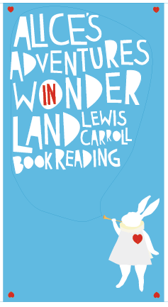
I want to use the classic image of the rabbit with the horn as if announcing the event

The chaotic type flows asif coming from the trumpet.

How the informational text may sit.
FMP Alice Brief!
Following the last crit, it was decided that the design below worked the best, I agreed but wanted to clarify it's colours before I went ahead and created the rest of the designs to accompany it.


This was the design that was chosen.
Colour variants.

I really like the blue combined with the red, I feel this in contrast with the pink makes the piece look more Alice in wonderland themed, compared to the pink on the other design which I feel perhaps makes it look too romantic based due to the image of the heart as well.

I really love the black on this one, although I'm hesitant towards the colour in use of something aimed at children, it may perhaps be a bit too dark for the title book, but still I really favor this colour.
Tuesday, 23 March 2010
Alice Ideas!
One of the ideas for the bookmark designs that relates to the bottle design.
I want to attatch the READ ME logo ( A spoof of the DRINK ME label) using a ribbon in a typical bookmark tag style.

I want to attatch the READ ME logo ( A spoof of the DRINK ME label) using a ribbon in a typical bookmark tag style.

Alice Book Dev.
I decided to dabble with the format and ideas for the bookmarks that would be part of this brief, as I did I realized that they could correlate with a book design, while I have only decided to create ONE book design, I created numerous bookmark designs, each with a quote regarding the book design they work with.


Alice Book Dev.
Wanting to perhaps give the book a more treasure sense, I have decided to turn the tabs into part of the cover itself, this has also given me ideas for the bookmark part of the design.


Alice Book Dev.
One of the ideas I've decided to take forward is that of the one below, I have now begun putting into the book cover format so I can print and see how it will work covering an actual book. After a few tutorials and chats with others, this design was the one that was the most well received for the brief, and I personally feel it's a style that I'm going to be able to continue as I branch out in the rest of the brief.


Monday, 22 March 2010
More book design ideas!
Still continuing to experiment with designs and ideas for my book cover, below, another digital based idea using the symbol of the heart.
After a tutorial, I decided that while this brief is intended on being extended into an event promotion brief, I have also decided to attempt to create an design for an in-store display etc that will compliment the rest of the designs.
But for now!


After a tutorial, I decided that while this brief is intended on being extended into an event promotion brief, I have also decided to attempt to create an design for an in-store display etc that will compliment the rest of the designs.
But for now!

Or the idea of spreading the heart accross the two pages of the front on the back, I'm not sure how far this could be tweaked to ensure it successful without changing the shape of the design.

Thursday, 18 March 2010
More dev.
Trying out my current idea with the rest of the requirements, the band across the cover could either be printed or be a separate piece, I'll have to test this to see how this will work. I'm not sure how I feel this silhouette idea will work aimed at children, I feel it works best in black and white and feel this may isolate my target audience, not as playful as intended.


More colour variations, to see how the piece will work instead of just in black and white.


Development.
Experimenting and continuing with my silhouette idea, but inverted but still using just black and white.


Below, is the same but with the 'flaps' style additions that would go under the cover itself, this I feel would add a more classic look to the book.


Subscribe to:
Posts (Atom)