
Showing posts with label FMP Memphis Belle. Show all posts
Showing posts with label FMP Memphis Belle. Show all posts
Friday, 4 June 2010
Memphis Belle Evaluation
Branding and promo was something I wasn't too familiar with and I felt perhaps this was my weakest brief, I wanted to see if I could successfully apply my illustrations to something for promo and branding and how strongly they would work, though I am happy with the outcome, I think I perhaps could have pushed the designs further, I realize I perhaps lost 'passion' for this brief and subsequiantally lost interest within it. I do feel the final pieces were successful and fulfilled the brief but I perhaps did not exploit the brief to its full potential. Overall, I think I can apply my illustrations to this type of brief, yet I must push the designing aspect further rather than rushing to develop the final outcome to produce a more susccessful brief.

Tuesday, 1 June 2010


Monday, 17 May 2010
Memphis Belle tags!
As this brief is drawing to an end, I want to create some matching clothes tags for the product to match the rest of the designs and work as a set.


Thursday, 15 April 2010
Memphis Belle Posters Cont.
After deciding to keep the design way more simple than what I was originally working with, below are two examples of how it's starting to come together in both the signature blue and pink!


Memphis Belle Cont.
Continuing with this brief, I have begun experimenting with the formats for a poster advertising the store. While I wanted to use the initial illustration, I've been hesitant about over complicating the poster with other information, especially since I will be creating a flyer which could possibly house the information not included on the poster.


This was the initial idea, but it was then brought to my attention, that the Memphis Belle was stated twice and this just added to the clutter of the piece.

This was another idea to work with imagery of the shop as well as the main illustration, the type would have been added in between these, but again this has become cluttered and unesscary.
So I've begun thinking about working with something like this, more simple, free of excessive images and information, that I can put on the flyer instead.

Memphis Belle bags
Below, some of the first photos of the bags I made for the project, I'm actually really happy the way these came out and love the combination of blue and pink, once these have been finalised I'll attempt some much better quality and contextual photos!
I think the black ribbon with them works well, I'd really like to attempt to print onto the ribbon too.


I think the black ribbon with them works well, I'd really like to attempt to print onto the ribbon too.


Monday, 22 March 2010
Memphis Belle!
Feeling reasonably happy with the logo I wanted to experiment with the application of it, below are a few layouts for possible gift bag designs for the shop!


Wednesday, 10 March 2010
Memphis Font ex.
Playing around with the way the text sits on the banner and the different fonts used.


Current Design

Experiments


The same again but with a neater curve on the type.


More Memphis Belle Logo Ex.Finalised
I really think the effect of a two banner style design on the illustration works better than the one, it also gives the text more emphasis and allows the illustration to work in the background. I still want to play about with the text to perfect it but this is the finalized general layout of it.


Colour version

More Memphis Belle Logo Ex.
After a recent tutorial, it became apparent that while the logo did look nice its focus is more on the illustration rather than the actual promotion of the shop, that the title of the shop was too small and overpowered by the image, so I've chosen to experiment with the position of the banner and the size of the text to change the focus from being solely on the illustration.


Original idea.

Experiments


Tuesday, 2 March 2010
Less Colour?
To avoid the logo, looking like a character rather than an illustrated logo, I have decided to see how it would work lacking colour, and keeping to just 3 or so colours plus black, which I feel will allow it to work well with the other promotional tools and won't force me to compromise the colours on them for the sake of the logo.


More Colour ex!
Begining to finalise the colour scheme of the logo, I like the use of the softer tones of colour, more pastel, they all seem to compliment each other well, but I feel with separate colours they become almost characters.


Logo Colour Experiment
Experimenting with colour combinations for the Memphis Belle logo design.


These are my personal favourites, the use of minimal colour specifically pink I think really works to the images benefit.


Memphis Belle Rebrand and Promo Brief
Beginning one of my other briefs, this will lead me to design rebranding for Leeds based vintage boutique Memphis Belle, a small boutique store in the centre of Leeds selling fancy dress, bespoke swing dresses and all sorts of throw back accessories.
The shop has pretty much no branding or promotion at all, and with the subject of the shop being a personal interest of mine I feel this can be a successful brief.
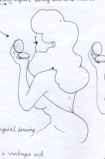
Initially I need to begin developing a logo. As through my design sheets I decide to run with the idea of featuring a vintage female figure in a cosmetic context. Below, the initial sketch of the figure.


The shop has pretty much no branding or promotion at all, and with the subject of the shop being a personal interest of mine I feel this can be a successful brief.
Initially I need to begin developing a logo. As through my design sheets I decide to run with the idea of featuring a vintage female figure in a cosmetic context. Below, the initial sketch of the figure.


Here she is once tidied up and vectored in Illustrator.


Playing with the idea of framing the figure in a decadent cameo style frame.

I feel this frilled oval frame works well for the figure, the heart shape being too big and perhaps overbearing for an illustrated logo.

Experimenting with the use of a ribbon around the frame where the text will lay.

Pop a bow on top, allows it a more feminine appeal.
Subscribe to:
Posts (Atom)