The shop has pretty much no branding or promotion at all, and with the subject of the shop being a personal interest of mine I feel this can be a successful brief.
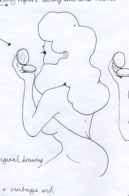
Initially I need to begin developing a logo. As through my design sheets I decide to run with the idea of featuring a vintage female figure in a cosmetic context. Below, the initial sketch of the figure.
Here she is once tidied up and vectored in Illustrator.
Playing with the idea of framing the figure in a decadent cameo style frame.
I feel this frilled oval frame works well for the figure, the heart shape being too big and perhaps overbearing for an illustrated logo.
Experimenting with the use of a ribbon around the frame where the text will lay.
Pop a bow on top, allows it a more feminine appeal.


No comments:
Post a Comment