
Friday, 4 June 2010
Alice Book Cover Evaluation
This was the longest of all my briefs chosen and perhaps the one that was exploited the most, I enjoyed pushing a simple idea of a book cover design into a full event and the promotion surrounding it. I feel I was able to successfully utilize my illustration skills regarding hand rendered type and computer generated images. I feel the end result works well as a set and the style of the outcomes is suitable and has great impact particularly the use of illustrated hand rendered type. I feel that this brief has allowed me to develop skills in working with a set of outcomes for high impact including book cover design and further promotion.
Memphis Belle Evaluation
Branding and promo was something I wasn't too familiar with and I felt perhaps this was my weakest brief, I wanted to see if I could successfully apply my illustrations to something for promo and branding and how strongly they would work, though I am happy with the outcome, I think I perhaps could have pushed the designs further, I realize I perhaps lost 'passion' for this brief and subsequiantally lost interest within it. I do feel the final pieces were successful and fulfilled the brief but I perhaps did not exploit the brief to its full potential. Overall, I think I can apply my illustrations to this type of brief, yet I must push the designing aspect further rather than rushing to develop the final outcome to produce a more susccessful brief.
Paper Product Evaluation
While this brief was my shortest, it was perhaps the one I enjoyed the most and was the most pleased with the results. Working to design a paper product range with my hand drawn illustrations was almost a breather from the other briefs and with it being a self written brief I felt I was able to put my own mark on it. This also worked well in conjunction with the Fox Bunting collective I work with, since I've received positive feedback from this project we have decided to start selling this range from our Etsy site and from our stall. I will continue to work to design this style of outcome and continue working with my hand rendered illustration style to develop more ranges to add to my portfolio.
Milk Packaging Evaluation
I have always had an interest in packaging, and specifically illustration based packaging, although it wasn't something I had experimented with a lot through out the course, so I decided to chose a Milk packaging based brief based on Moo Milks cartons to design a suitable package for their range of flavoured milks. Changing the brief into a small campaign allowed me to develop a tag line and approach that I could use to allow the cartons and poster to work as a set, and this I feel was successful. The design applied to the milk carton perhaps was the most stressful point of this brief, as I took perhaps too long to make the decision on which worked best but I felt, finally when I chose the chosen design, it was the most suitable. Overall this brief allowed me to develop and refine my approach to packaging and successfully apply my illustration styles to it, I do now realize I have to be more swift when making decisions and not to waste time by focusing on this for too long. I would like to continue to work with illustration and packaging after receiving some positive feedback on this brief from online resources.
Hovis Evaluation
I approached this brief initially as a simple merchandise design brief, but I realized that the merchandise aspect would just be more of an outcome, so I decided to turn the brief into a pattern based brief that can be applied to multiple outcomes resulting in merchandise. I enjoyed working with the pattern based design and almost regret not participating in this kind of pattern based brief before as I felt confident designing the initial illustrations and combining them together in a successful way to create a pattern that not only is applicable to outcomes, but can be 'tweaked' and adjusted in shape, form and colour to suit the media it is intended to be applied to. I chose not to screen print the pattern onto the two main outcomes to save time, and chose to use digital transfer paper to print onto the oven glove and tea towel, the printing method worked but it didn't come out as neat as I hoped, by this time I felt it too late to screen print so the pattern was slightly photoshopped on the photographs I took. Overall I felt this was a successful brief and reflects my pattern based illustrations well.
End of Module Evaluation
My initial intentions for this module was to push my styles and methods of illustration further by choosing to apply them and working within the discipline of applied illustration for this final major project. I feel that as an illustrator I wanted to display that I don't just merely create images for the sake of creating an image, but for them to have a suitable context and work well with the designed outcomes and I feel I succeeded in this. The briefs I chose, I chose specifically due to the variation between them, which where; packaging, promotional/branding, book cover design, pattern and paper product design, these allowed me to create a selection of designs and outcomes very different in style and method but still illustration based and I am happy with the outcomes I have created.I feel throughout this FMP I have allowed myself to develop my own personal ways of working with illustration and accept using different stylistic approaches for different briefs to produce the most suitable outcomes.
I feel that over the past three years and over this past module specifically my design practice has been polished and refined, I feel confident in what I know I can create and I'm more aware of what won't work for my way of working within design. At the beginning of the module, it felt like a slow start, I felt perhaps unsure of where myself and my work would be placed within the commercial industry and how to approach it over the last project, but soon after refining my choice of briefs I realized that the variation would be the strength of pushing my work as before I was trying to find briefs that were entirely focused on illustration, while these allowed me to chose open briefs and approach them with illustration I soon picked up the pace and began enjoying the project. I found working between hand rendered and computer based imagery really allowed me to grow a greater appreciation of translating an initial idea to its final resolution, and having the confidence to make the right decisions to get it there.
While working through this project, I continued to create work outside of this, I took on more commissioned works for Burlesque events and performers which allowed me to gain a knowledge of working for a paying client and to a specific set brief. I felt comfortable and confident in working through a process of emails, having to change, tweak and adjust to the clients specifics and feel I gained a lot from allowing myself to experience a freelance approach to working as an illustrator. I also began to feel the idea of a successful live piece of paid work too!
My design context allowed myself to sum up my design practice and what drives it, I found this incredibly useful, especially interviews I took part in and collected from artists who were exactly where I aim to be in a matter of time, while the end product didn't turn out as well as I hope due to a series of printings errors, I feel the final piece itself works successfully and definitely reflects on who I am as a designer and where I am to be and what will drive me there.
I feel I am now in possession of a series of pieces and outcomes that will add towards my portfolio, displaying me as an illustrator, but an applied illustrator who can work to many different types of briefs in a manner of different styles, but more importantly can make the right decisions on how to approach these briefs and what styles work best.
As cliche as it perhaps sounds, I feel this has been my most successful module for me personally, I feel I have pushed my designs and worked well towards the end of this module, and the course and finally feel more confident with where my work will sit and be applied in a commercial industry.
Tuesday, 1 June 2010
Hovis final photos!
Photos of my final outcomes for the Hovis brief, I'm really happy with how these turned out, but I am aware that it is visable that the print has gone slightly wrong on the oven glove, but I feel it still shows the pattern applied successfully.


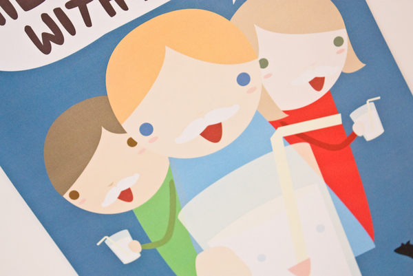
Context shots for Milk project!
Some shots I took regarding the context of the milk brief, complete with milk tache!


Milk Product Shots!
Here, some of the product shots of the milk containers I took alongside the poster, I'm really happy with the way they've turned out and feel they work really successfully as a set.


Thursday, 27 May 2010
Paper product shots!
After assembling all my designs together, I got the chance to take some studio shots of them all together. I'm really pleased with the way these have turned out and have put them on my Behance site and had some positive feedback already.


Monday, 24 May 2010
Paper Product cont.
Now the pattern itself has been settled on, the application is the next step, I've created it suitable to be a wrapping paper and gift bags, now I wish to create matching gift tags. From the crit last week, many felt that the characters should have more of their own 'spotlight' in the form of a gift/greeting card so thats my next step.


Format Ideas.
Debating the best possibly format for the greetings/gift card.

The square format is currently what I think will work best for the more rounded shapes of the characters.

This lengthier format could work for a design featuring multiple characters.

Standard portrait format will work well for framing longer less rounded characters.
Experimenting with applying the pattern/designs, below, to a card format made me realise that a design of multiple characters will work better as a gift tag rather than a greetings card.

Like below!


Below, this is how I think it'll work!

Rounder characters on the square format card ^

Longer characters on the more portrait format.
Paper Product cont.
Continuing to try and resolve the products of my paper product design brief, after last weeks crit I realised the images of the characters printed onto the gift bags were far too small and thus losing detail, so I've decided to allow the images more room with less of them, so that the detail will be more visable.
Layouts for the gift bags.


Layouts for the gift bags.


Monday, 17 May 2010
Memphis Belle tags!
As this brief is drawing to an end, I want to create some matching clothes tags for the product to match the rest of the designs and work as a set.


Playing with textures!
Wanting to add a bit more depth to my posters, here, playing with some textures!


Milk Poster design!
As a final design for this brief I want to create a poster aimed at young children and their families to promote milk drinking through healthy flavoured milks in a fun and non patronizing way.


Milk Designs!
After much experimenting with the designs character, these below are my final descisions on the matter.


Chocolate flavour

Strawberry flavour

Banana flavour
Subscribe to:
Comments (Atom)