

Tuesday, 2 March 2010
Less Colour?
To avoid the logo, looking like a character rather than an illustrated logo, I have decided to see how it would work lacking colour, and keeping to just 3 or so colours plus black, which I feel will allow it to work well with the other promotional tools and won't force me to compromise the colours on them for the sake of the logo.


More Colour ex!
Begining to finalise the colour scheme of the logo, I like the use of the softer tones of colour, more pastel, they all seem to compliment each other well, but I feel with separate colours they become almost characters.


Logo Colour Experiment
Experimenting with colour combinations for the Memphis Belle logo design.


These are my personal favourites, the use of minimal colour specifically pink I think really works to the images benefit.


Memphis Belle Rebrand and Promo Brief
Beginning one of my other briefs, this will lead me to design rebranding for Leeds based vintage boutique Memphis Belle, a small boutique store in the centre of Leeds selling fancy dress, bespoke swing dresses and all sorts of throw back accessories.
The shop has pretty much no branding or promotion at all, and with the subject of the shop being a personal interest of mine I feel this can be a successful brief.
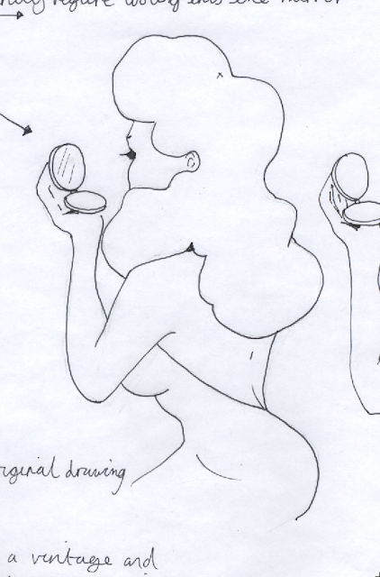
Initially I need to begin developing a logo. As through my design sheets I decide to run with the idea of featuring a vintage female figure in a cosmetic context. Below, the initial sketch of the figure.


The shop has pretty much no branding or promotion at all, and with the subject of the shop being a personal interest of mine I feel this can be a successful brief.
Initially I need to begin developing a logo. As through my design sheets I decide to run with the idea of featuring a vintage female figure in a cosmetic context. Below, the initial sketch of the figure.


Here she is once tidied up and vectored in Illustrator.


Playing with the idea of framing the figure in a decadent cameo style frame.

I feel this frilled oval frame works well for the figure, the heart shape being too big and perhaps overbearing for an illustrated logo.

Experimenting with the use of a ribbon around the frame where the text will lay.

Pop a bow on top, allows it a more feminine appeal.
New Hovis Idea
I want to create something more illustration based for the Hovis brief, something more playful and flexible allowing more possibilities for application to various merchandise.
So, using the same idea development as the previous design, I have been thinking of everything relative to bread, the lifestyle surrounding it and the things we can create from it and of-course, eat!
I creating a large pattern based on these things from hand drawn images photoshopped. This is only the black and white original version at the moment, I will experiment with further colours.


So, using the same idea development as the previous design, I have been thinking of everything relative to bread, the lifestyle surrounding it and the things we can create from it and of-course, eat!
I creating a large pattern based on these things from hand drawn images photoshopped. This is only the black and white original version at the moment, I will experiment with further colours.

I experimented with colours based on neutral tones and 'bread' like colours, I really like the way these have come out and will now like to attempt to print them on an oven glove and a tea towel.


Further Hovis Designs
Here is my initial Hovis design pattern but on a larger scale with increased panels with different "A..is for.." ideas, I'm not feeling to happy with the design as I personally don't feel it's particularly me, the type isn't exactly strong and neither I am when handling type, I'm finding this more of a type based image and that's not what I intend to create.

The same pattern idea again but experimenting using different typefaces, I'm losing interest for this idea particularly and want to experiment with something more illustration based that will work as an applied pattern.

Subscribe to:
Posts (Atom)